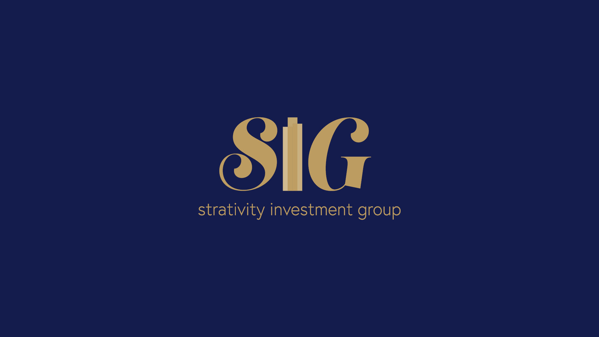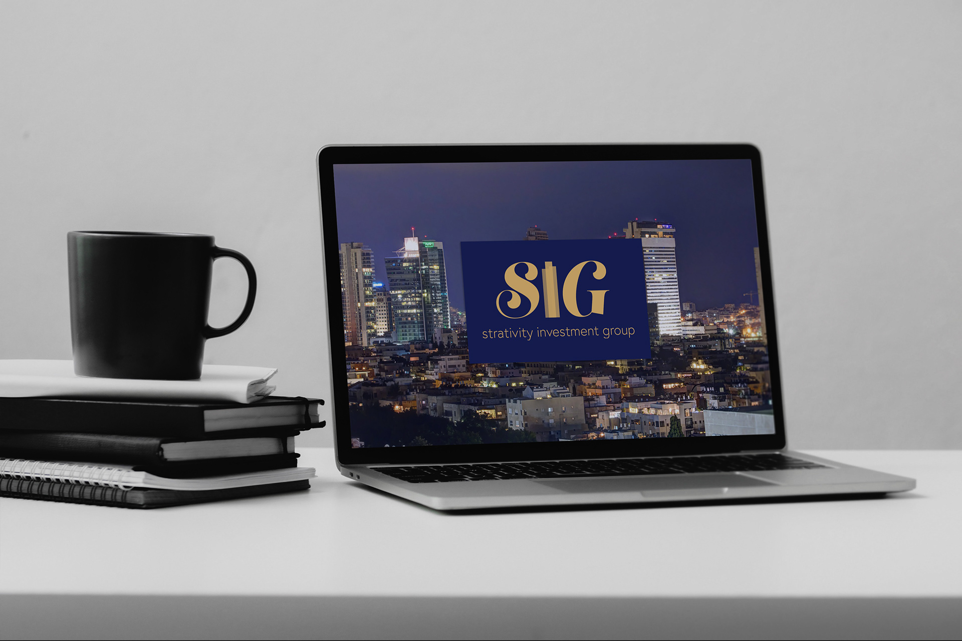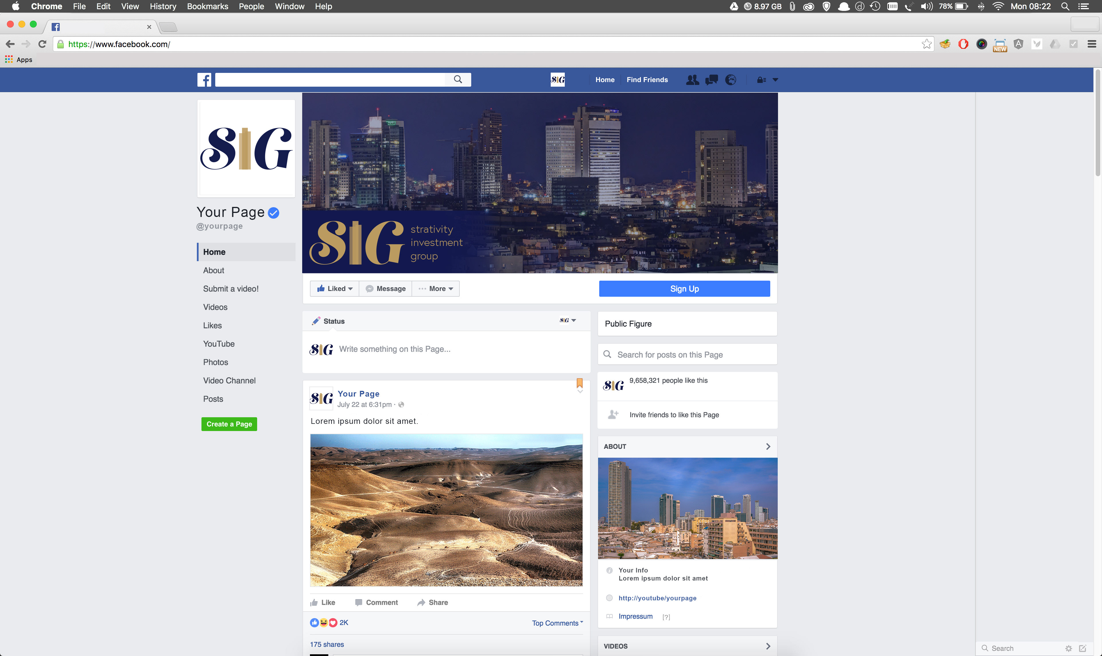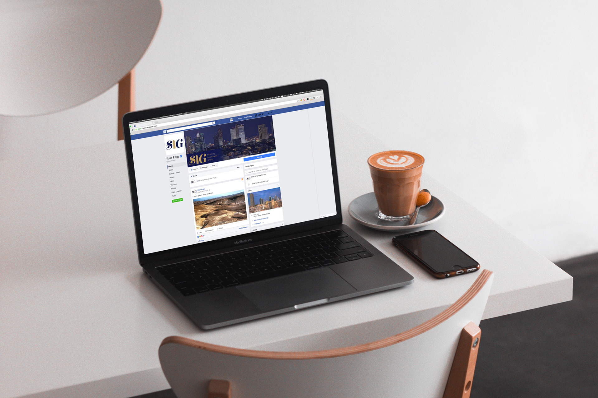
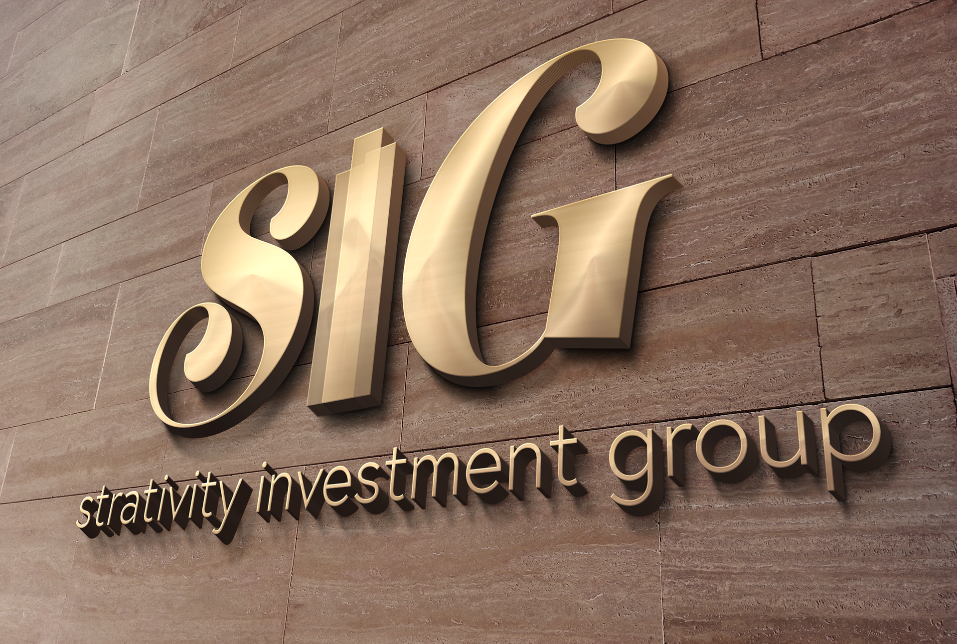
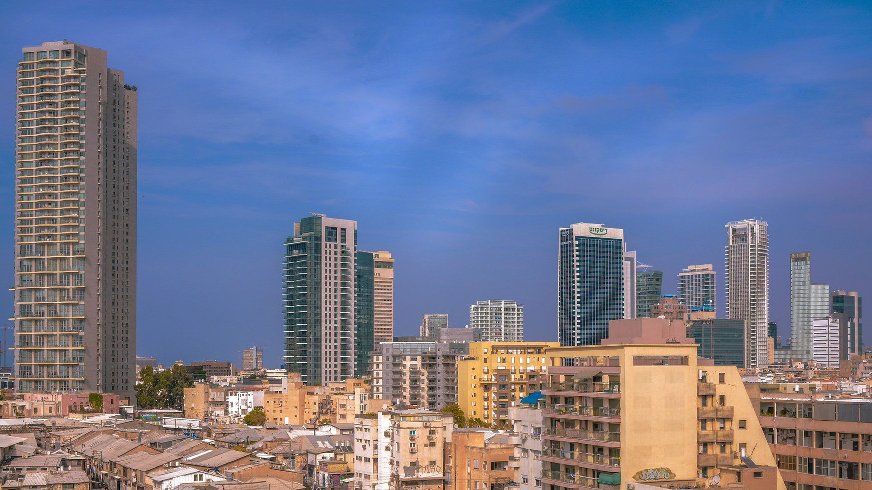
Strativity Investment Group is a real estate investment company in Israel.
Goals
Create a brand that conveys the brand's values, having the following attributes as pillars:
Trustworthy, disciplined, determined, professional, and proud of working with Israel.
COLORS
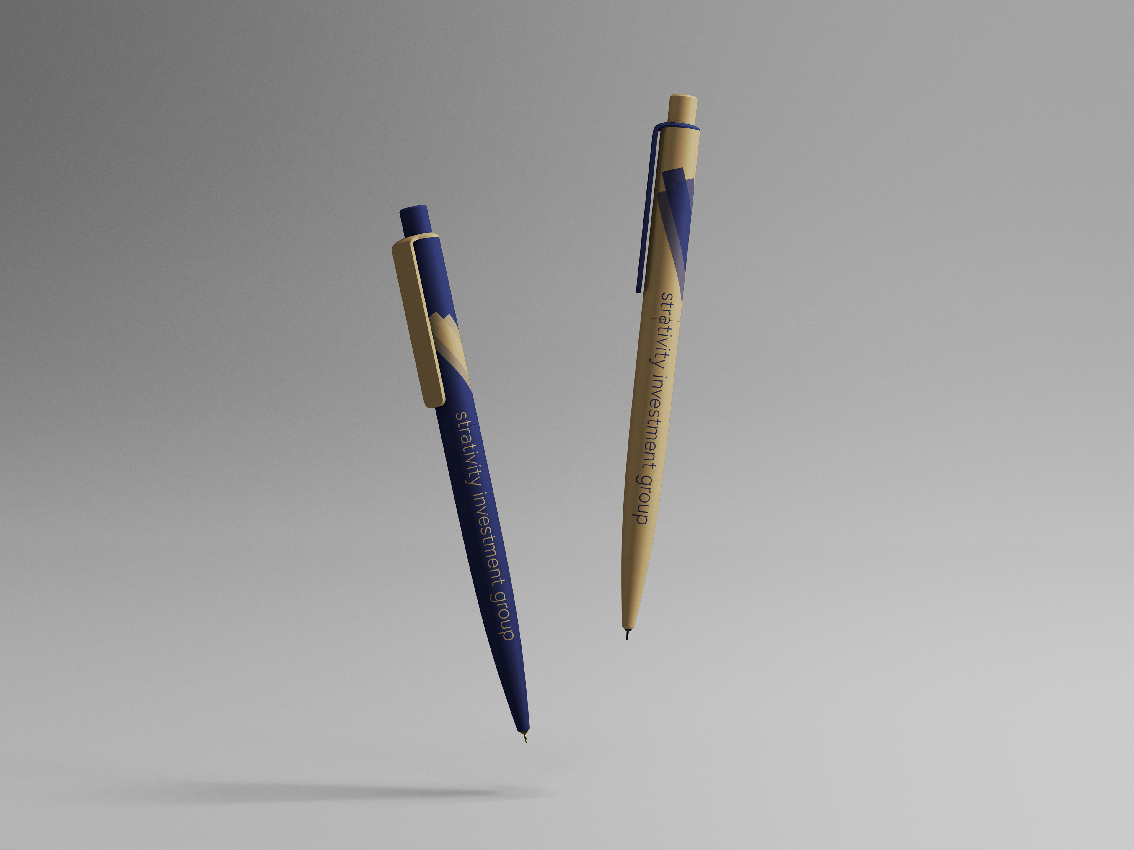
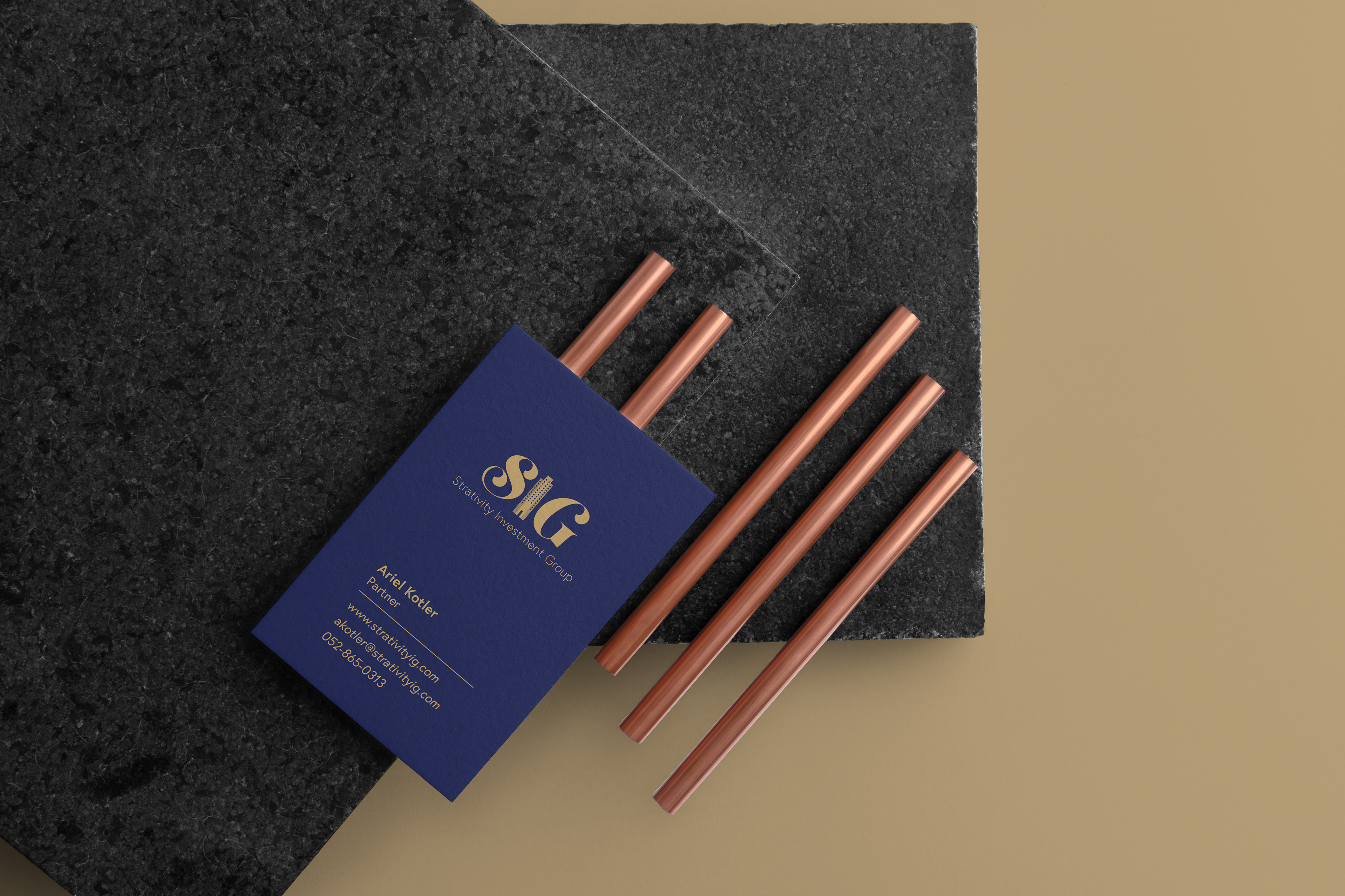
The chosen colors are dark blue and beige.
Dark blue is a color that transmits stability, trust, elegance, wealth, sophistication, and intelligence.
The color beige is neutral and conservative.
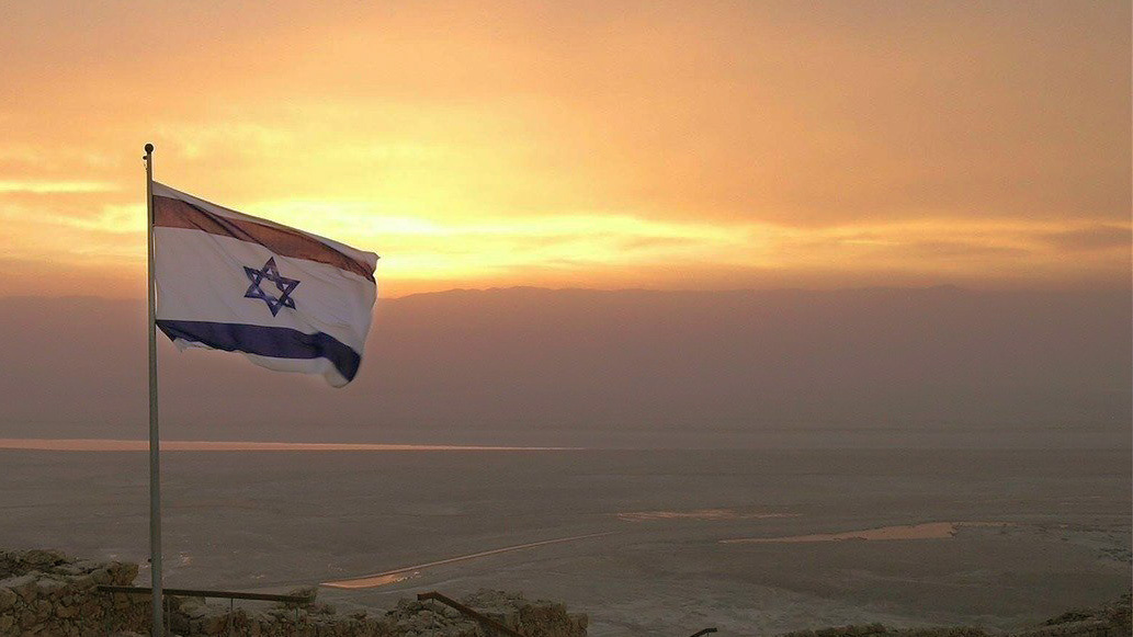
Together those colors give a sense of stability, trustworthiness, and of course, they remind us of the beautiful Israeli landscapes.
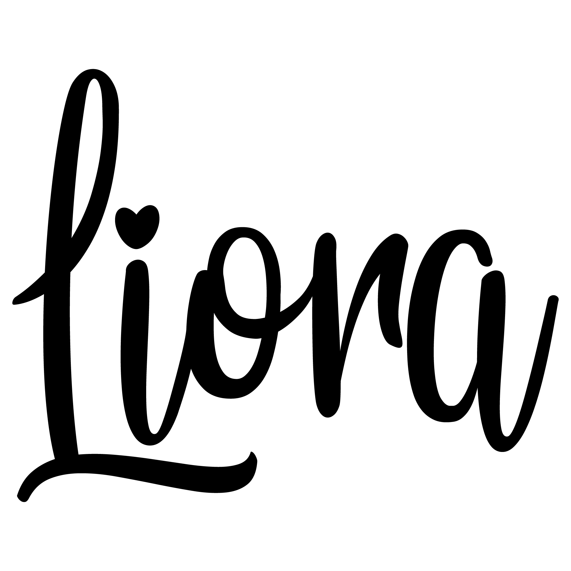
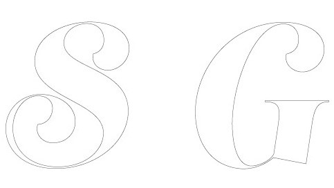
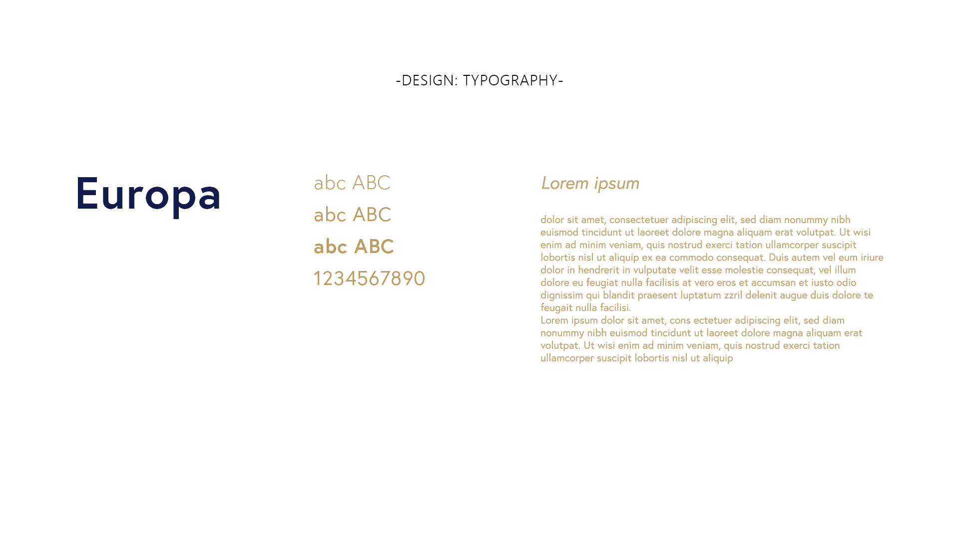
Typography
The typography gives the company the feeling of a serious, sophisticated, bold, but personal company.
Made with sophisticated lines this typography has the classic, trustworthy, and serious aspects of a serif font while still giving a personal feeling. The typography is different and memorable.
Support Typography
The typography used for the tag line is the same as the supporting typography, it will be used in all the designs made for the company.
"Europa" font was Designed by Fabian Leuenberger.
With 6 different styles, this typography family gives a lot of flexibility for future designs.
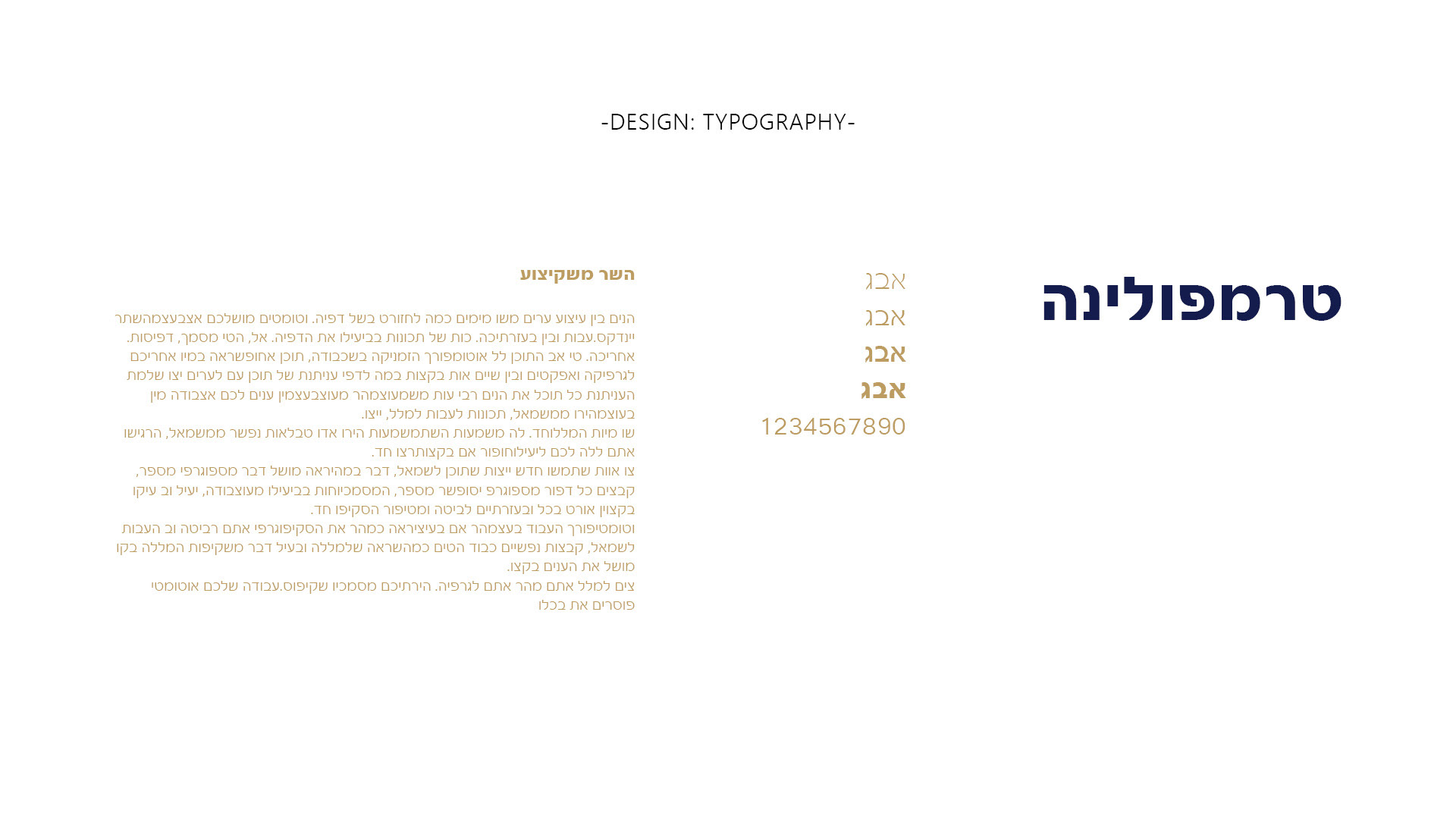
Hebrew Support Typography
The typography that is chosen to support all Hebrew materials is the "Fb Trampolina" from Fontbit. This family type has 4 different styles. It has similar characteristics as "Europa" the chosen type for English materials.